
The psychology of being too close to your own messaging
Most messaging problems are not caused by poor thinking or weak products. They happen because businesses are too close to what they are trying to explain. Familiarity creates blind spots. What feels obvious internally often creates confusion externally. In B2B SaaS, this shows up through product-led messaging, unclear value propositions, and buyer journeys built around internal logic rather than customer understanding. Fixing it usually does not require more effort. It requires distance, perspective and a clearer view of how buyers actually experience your message.

Most companies do not struggle with messaging because they lack intelligence.
They struggle because they know too much.
When you spend months or years building a product, every feature makes sense. Every decision feels logical. Every phrase on the website feels clear because you already understand the context behind it.
Internally, there is alignment.
Externally, there is confusion.
We see this constantly. Strong teams, strong products and messaging that feels perfectly reasonable from the inside. Yet the website does not convert, sales cycles feel longer than they should and buyers hesitate in places that are difficult to explain.
That hesitation rarely comes from a lack of interest.
It usually comes from a lack of clarity.
The problem is not what you are saying. It is how easily someone new can understand it.
That gap between internal certainty and external confusion is where most messaging problems begin.

This is not just a marketing issue. It is a psychological one.
There is a well-known cognitive bias called The Curse of Knowledge. Once you understand something deeply, it becomes difficult to imagine what it feels like not to know it.
You stop seeing the gaps.
What feels simple to you feels incomplete to someone else. What sounds obvious internally sounds vague externally.
This happens everywhere in SaaS messaging.
A homepage headline sounds strong because the team already knows what it means. Product descriptions feel clear because everyone involved understands the feature set. Navigation makes sense because it reflects how the company thinks about itself.
But buyers are not inside the business.
They are arriving cold, trying to work out whether this is relevant, useful and worth their time.
If they have to interpret too much too early, momentum slows.
That is where conversion starts to weaken.

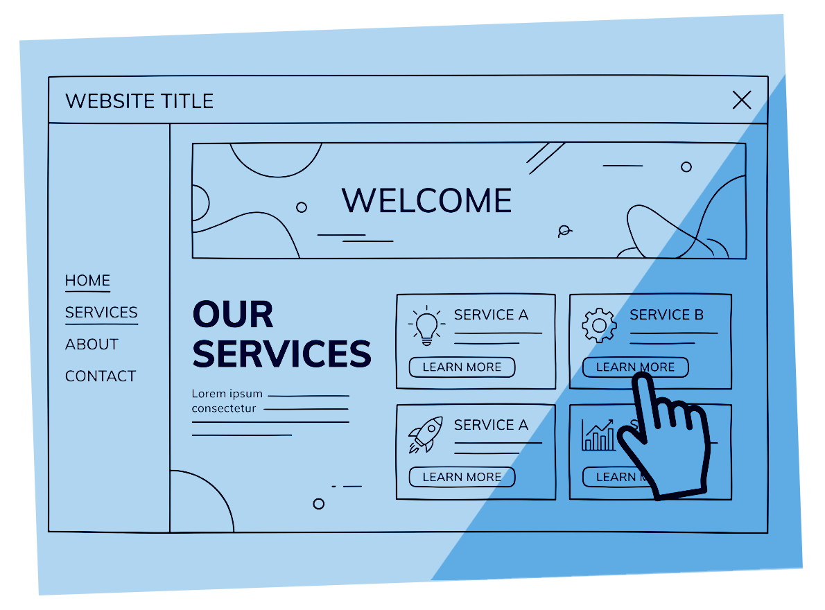
One of the clearest symptoms of being too close to your own messaging is product-led communication.
Businesses naturally talk about what they have built.
Features feel tangible. They can be listed, compared and defended. Outcomes feel broader, less precise and sometimes harder to claim confidently.
So messaging starts with the product.
The problem is that buyers are not looking for features first.
They are trying to understand what changes for them.
Will this save time? Reduce risk? Improve revenue? Remove friction? Make decisions easier?
If your messaging starts with functionality before relevance, the buyer has to do the translation themselves.
Many will not.
We explored this more directly in our article on why product-led messaging is killing your pipeline, because it is one of the most common commercial consequences of unclear positioning.

Another common issue is structure.
Most websites are organised around how the business sees itself, not how the buyer makes decisions.
Navigation reflects departments instead of buyer questions. Service pages explain capability instead of solving recognised problems. Value propositions assume a level of understanding that does not exist yet.
Internally, this feels sensible.
Externally, it creates work.
A buyer should not need to decode your business model to understand why they should stay on the page.
This is often where homepage conversion drops first. People arrive, sense potential value, but do not get enough clarity quickly enough to keep moving.
That is why we often start with the homepage when diagnosing messaging issues. It is where the friction becomes visible earliest.
We covered that in more detail in our article on why your SaaS homepage is not converting.

Imagine a homepage headline that reads:
“An integrated platform for workflow automation and data orchestration.”
It sounds professional. It sounds credible. Everyone internally agrees it captures the product accurately.
But from the outside, it creates effort.
The buyer has to ask: what does that actually mean for me?
Now compare it to:
“Remove the manual work slowing your team down.”
Same product. Same capability.
But the second version creates immediate relevance. It connects to a problem the buyer already understands.
Nothing about the product changed. Only the point of entry changed.
This is what being too close to your own messaging hides.
You choose the version that feels most complete, when the buyer needs the version that feels most clear.

Most messaging problems survive because nothing looks obviously broken.
The site looks polished. The copy reads well. Stakeholders approve it. Analytics show traffic and engagement.
So the assumption becomes that the issue must be somewhere else.
Usually, it is not.
Small clarity problems are difficult to detect from the inside because they do not feel like problems. They feel like normal language.
A slightly vague headline. A paragraph that explains too much too soon. A menu label that makes sense only if you already know the structure.
None of these trigger alarm bells.
Together, they create hesitation.
And hesitation is expensive.
It shows up as slower sales, weaker conversion, and buyers who seem interested but never quite move.
This is why so many businesses end up trying to fix performance with more traffic, more campaigns, or more content when the real issue is clarity.

The impact is rarely dramatic.
It shows up quietly.
Fewer people move beyond the homepage. Fewer qualified leads enter the pipeline. Sales teams spend more time explaining things that should already be obvious. Decision cycles get longer.
None of these are usually blamed on messaging.
Instead, they are absorbed into broader assumptions about market conditions, lead quality, or buyer hesitation.
But if people do not clearly understand the value early enough, everything downstream becomes harder.
That is why messaging is not just a copy issue. It is a commercial one.
Clarity affects conversion. Conversion affects pipeline. Pipeline affects growth.
The problem starts much earlier than most teams realise.

This is where outside perspective becomes valuable.
Not because external people are more creative.
Because they are less burdened by familiarity.
They see what buyers see.
They notice where clarity breaks down. They question assumptions that feel invisible internally. They spot where messaging asks too much of the reader too early.
This is often the biggest benefit of a structured messaging audit.
It is not just about rewriting copy. It is about identifying where understanding slows and what that is costing commercially.
That is why the best messaging work often starts with diagnosis, not content production.
Fixing the wrong thing is expensive. Seeing the real issue first is what creates value.

The first step is not rewriting.
It is asking better questions.
Can someone new understand what you do within a few seconds?
Does your homepage lead with outcomes or features?
Does your navigation reflect buyer behaviour or internal structure?
Are sales teams regularly re-explaining things the website should already make clear?
These questions usually reveal more than another round of copy edits.
It also helps to listen carefully to how prospects describe their own problem. Buyers often tell you the language they trust. Most businesses simply stop hearing it because they are too close to their own terminology.
Clarity often comes from subtraction, not addition.
Removing assumptions. Removing unnecessary explanation. Removing the gap between what you mean and what the buyer actually hears.

Most messaging problems are not caused by bad strategy.
They are caused by proximity.
When you know something too well, you stop seeing where it is unclear.
That is why strong businesses still struggle with weak conversion.
Not because the product is wrong. Because the explanation is.
If your messaging feels clear internally but does not convert externally, the answer is rarely to try harder.
It is usually to step outside it.
That is where clarity starts.
Next step
If your messaging feels right but buyers are still hesitating, it is often because the problem is difficult to see from the inside.
That is usually the point where an external view starts to make a difference.
A structured messaging audit helps identify where clarity breaks down, what is creating friction, and what needs to change first.
Why your SaaS homepage isn’t converting (and how to fix it)
It All Begins Here
If your SaaS homepage isn’t converting, the issue is rarely traffic or product quality. It is usually clarity. Most homepages focus on features instead of outcomes, use internal language, and create friction in structure and navigation. Fixing conversion starts with making your value clear quickly and removing the points where buyers hesitate.

If your SaaS homepage isn’t converting, something is getting in the way.
Not in a dramatic or obvious sense. More often, it is subtle. The kind of issue that does not show up clearly in analytics but shows up in behaviour. People land, scroll, and leave.
We see this all the time. The product is strong. The thinking behind it is sound. Internally, everything feels clear and well structured.
Externally, it does not land in the same way.
The homepage is asking the buyer to do too much work. To figure out what you do, to translate features into value, and to decide whether it is relevant. Most people will not take the time to do that.
That is where conversion starts to drop.
If this feels familiar, it often comes back to the psychology of being too close to your own messaging.

A homepage does not need to explain everything. It needs to remove doubt.
When someone arrives, they are trying to get their bearings. What is this? Is it for me? Is it worth continuing?
If those questions are not answered quickly, momentum is lost.
Many SaaS homepages struggle here because they try to cover too much ground. They introduce the company, explain the product, and list features, all at once. The result is not more clarity, it is less.
A strong homepage gives the reader something to hold on to early. A clear sense of what this is and why it matters. Everything else builds from there.

Conversion rarely fails because something is completely wrong. It fails because something is not clear enough.
That lack of clarity creates friction at the point where interest should turn into action. It shows up in small ways. A headline that sounds good but does not say anything specific. A section that assumes knowledge the reader does not yet have. Copy that explains how something works without first explaining why it matters.
Individually, these are easy to overlook. Together, they slow people down.
In B2B, hesitation is often the difference between a lead progressing or disappearing altogether.

There is a consistent pattern behind low-converting SaaS homepages. It is not usually one issue, but a combination of familiar ones.
The first is product-led messaging. The homepage focuses on what the product does rather than what the buyer gets from it. This feels logical internally, but it creates distance for the reader.
The second is internal language. Terms and phrases that make perfect sense within the business do not always translate externally. They require effort to understand, and that effort creates friction.
The third is a lack of focus. Too many ideas compete for attention, which means none of them land properly. Instead of guiding the reader, the page leaves them to make sense of it themselves.
Finally, there is often no clear next step. Even when interest is there, the path forward is not obvious.
None of these feel like major problems in isolation. Together, they are enough to stop people moving forward.

Product-led messaging is one of the most common causes of poor homepage performance.
It is also one of the hardest to spot internally, because it feels like the right thing to do. You have built something valuable, so naturally you want to explain it.
The problem is that buyers are not starting from the same place as you. They are not thinking about features or functionality. They are thinking about their own situation and what they are trying to achieve.
When your homepage leads with the product, it skips over that context. It asks the reader to bridge the gap themselves.
Some will. Many will not. And, that is where momentum is lost.
We break this down further in our Two Degrees article on why product-led messaging affects pipeline.

It is easy to think of messaging as just copy, but structure plays an equally important role.
If people cannot move easily through your site, their confidence drops quickly. They start to question whether they are in the right place.
This often comes down to how navigation is organised. Menus reflect how the business thinks about itself rather than how a buyer explores. Important information is not where people expect to find it. Labels require interpretation rather than being immediately clear.
These are not dramatic issues, but they add friction to the experience. And friction is what slows conversion.

High-converting homepages are not necessarily more creative or more detailed. They are clearer.
They tend to start with a specific, outcome-focused message that gives the reader immediate orientation. The language is simple and direct. The structure follows a logical flow that makes it easy to understand what is being offered and why it matters.
There is usually one core idea running through the page, supported by proof and explanation. Nothing feels unnecessary or out of place.
Most importantly, the next step is obvious. The reader is not left deciding what to do.

One of the reasons homepage conversion issues go unresolved is that nothing appears obviously broken. The design is clean. The copy reads well. The product is strong. On the surface, everything looks as it should. That creates a false sense of confidence.
Internally, the homepage is often judged on whether it feels right rather than whether it performs clearly. If stakeholders can read it and understand it, it is assumed that buyers will too.
But buyers are not reading carefully. They are scanning, filtering, and making quick decisions based on partial understanding.
What feels clear when you already know the context often becomes vague when you do not.
This is why small issues go unnoticed. Each one seems minor. A slightly unclear headline. A section that takes a second too long to land. A phrase that needs interpreting.
On their own, none of these trigger alarm bells but together, they create just enough friction to stop momentum. That is what makes homepage conversion difficult to fix. The problem is not visible in isolation. It only becomes clear when you step back and look at how the whole experience feels to someone new.

When a homepage does not convert, the impact is rarely immediate or obvious.
It shows up over time.
Fewer people move beyond the homepage. Fewer qualified leads enter the pipeline. Sales conversations start later and require more explanation. Decisions take longer.
None of these are usually traced back to the homepage directly. Instead, they are absorbed into broader assumptions. That the market is slow. That buyers need more nurturing. That more traffic is required.
In reality, a lack of clarity at the start of the journey is often the cause.
When messaging is unclear, buyers hesitate. When they hesitate, they delay action or look elsewhere. That hesitation compounds across the funnel.
It affects not just conversion rates, but the quality of leads and the efficiency of sales. Teams spend more time explaining things that should already be understood. Marketing produces more content to compensate for gaps that should not exist.
This is why clarity is not just a copy issue. It is a commercial one.

Most homepage analysis focuses on what is on the page. What matters just as much is what happens in the buyer’s head. When someone lands on your homepage, they are making quick, low-effort decisions. They are not trying to fully understand your product. They are trying to decide whether it is worth the effort to continue.
That decision is shaped by a few simple reactions:
Does this feel relevant to me?
Do I understand what this does without thinking too hard?
Does this feel credible?
If the answer to any of these is uncertain, they slow down. They might scroll a little further. They might click somewhere else. Or they might leave and return later, if at all.
This is where many SaaS companies misread behaviour. A drop-off is not always a rejection. Often, it is uncertainty. And uncertainty is usually caused by a lack of clarity, not a lack of interest. Understanding this changes how you approach your homepage. Instead of asking whether the information is there, you start asking whether it is landing quickly enough to keep someone moving.

Improving conversion does not always require a complete redesign. Often, the gains come from clarifying what is already there.
Start with the headline. It should make the outcome clear, not just describe the product. If someone reads it and still has to interpret what it means, it is not doing its job.
Then look at how the page is structured. Does it guide the reader through a clear sequence, or does it jump between ideas? Simplifying the flow often has a bigger impact than adding more content.
It is also worth reviewing the language used throughout. Anything that relies on internal understanding should be reworked into something more accessible.
Finally, consider how the page ends. If someone is interested, is the next step clear and easy to take? If not, that is an opportunity to improve conversion without changing anything else.

Sometimes the issue is not one element, but how everything fits together.
That is where it becomes difficult to diagnose internally. Not because the team lacks ability, but because they are too close to it.
A structured messaging audit looks at where clarity breaks down, why people hesitate, and what needs to change. It connects the dots between individual issues and overall performance.
If this feels familiar, it is often picked up quickly once you step outside the day-to-day view.

If your SaaS homepage is not converting, it is rarely because people are not interested.
It is usually because something is getting in the way of them moving forward.
Most of the time, that something is clarity.
And clarity is fixable.

Why product-led messaging is killing your pipeline
Product-led messaging feels logical, but it often weakens pipeline. When you lead with features instead of outcomes, buyers have to work to understand relevance. That slows decisions, reduces conversion and creates friction across the funnel. Shifting to outcome-led messaging makes your value clearer, improves engagement and helps more deals move forward.
Product-led messaging sounds like the right approach. You have built something valuable. You want to explain what it does, how it works and why it is better than the alternatives. Internally, that feels like clarity.
Externally, it often has the opposite effect.
Instead of helping buyers move forward, it makes them pause. They are presented with functionality before they understand why it matters. They are asked to interpret before they are convinced.
That extra step is where momentum slows.
We see this across SaaS companies of all sizes. Strong products, well designed sites, and messaging that feels solid internally. Yet pipeline does not grow as expected.
In many cases, the issue is not the product. It is how it is being communicated. If you have already looked at why your SaaS homepage is not converting, this is often the reason sitting underneath it. The homepage is not failing on its own. It is reflecting a deeper messaging problem.

The reason product-led messaging persists is simple. It makes sense to the people closest to the product.
Teams spend months or years building something. They understand the features, the architecture, the technical advantages. When they describe the product, they naturally start there.
It feels accurate. It feels complete.
It also feels safe. Features are tangible. They can be listed, compared and explained in detail. Outcomes feel less concrete, especially when they vary by customer.
So messaging defaults to what is easiest to articulate.
The problem is that buyers are not starting from the same place.
They do not know your product. They do not share your context. They are not trying to understand functionality for its own sake.
They are trying to understand whether this is relevant to them.

When someone lands on your site or reads your messaging, they are not trying to fully understand everything.
They are making a quick judgement.
Does this apply to me?
Is this worth my time?
Do I want to learn more?
If the answer is not clear within a few seconds, they slow down or leave.
Product-led messaging interrupts that process.
Instead of answering those questions directly, it introduces detail. It explains capabilities before establishing context. It assumes interest before earning it.
That creates a gap.
The buyer has to translate features into outcomes. They have to work out how this fits their situation. They have to decide whether it is worth continuing.
Some will make that effort. Many will not.
This is closely linked to the psychology of unclear messaging. When you are too close to your product, it is easy to assume the value is obvious. In practice, it often needs to be made explicit.

The impact of product-led messaging is not always visible in one place.
It shows up across the entire funnel.
At the top, fewer visitors move beyond the homepage. Messaging does not land quickly enough to create momentum.
In the middle, engagement is weaker. People read, but do not fully connect with what they are seeing. Interest does not build in the way it should.
Further down, sales conversations take longer. Prospects arrive without a clear understanding of the value, so teams spend time explaining what should already be clear.
All of this slows pipeline.
It does not necessarily reduce traffic. It does not always reduce interest. But it reduces the number of people who move forward with confidence.
That is what makes it difficult to diagnose.
Everything appears to be working. But performance does not match expectation.

Most product-led messaging follows a similar structure.
It starts with a broad statement about the product. Something that sounds credible but requires interpretation.
It then moves into features. What the platform does, how it works, what makes it different.
By the time it gets to outcomes, the reader has already had to do too much work and moved on.
Compare that to the alternative.
Start with the outcome. Make the relevance clear immediately. Give the reader a reason to care.
Then introduce the product as the way that outcome is achieved.
Nothing about the product changes. But the way it is understood does.
This is the difference between messaging that explains and messaging that connects.

It is easy to think of messaging as a marketing concern.
In practice, it affects sales just as much.
When messaging is unclear, prospects arrive with gaps in understanding. They may be interested, but they are not fully convinced. They need more explanation, more reassurance, more context.
That increases the effort required to move a deal forward.
It also affects who enters the pipeline in the first place. If the value is not clear early on, the right people may not engage at all.
This is why product-led messaging is not just a copy issue. It is a pipeline issue.
It changes both the quantity and quality of opportunities.

Outcome-led messaging starts from a different place.
Instead of asking, “what does the product do?”, it asks, “what does the buyer get?”
As Harvard Business School professor Theodore Levitt famously observed, "People don't want a quarter-inch drill. They want a quarter-inch hole."
That shift sounds simple, but it changes everything. The opening message focuses on a problem or result that the buyer recognises.
It gives immediate context. It answers the question of relevance before anything else.
From there, the product is introduced as the means to that end.
Features still matter. They still need to be explained. But they are framed in a way that makes sense because the outcome is already clear.
This reduces the amount of interpretation required.
It also makes the messaging easier to remember. Outcomes are easier to hold on to than lists of functionality.

Take a typical product-led line:
“An integrated platform for workflow automation and data orchestration.”
It is accurate. It sounds sophisticated. It also requires effort to understand.
Now shift it to an outcome:
“Automate the manual work slowing your team down.”
The capability is the same. The product has not changed.
But the second version connects immediately. It gives the reader something familiar. It frames the problem in a way that makes sense without explanation.
From there, everything else becomes easier to process.
This is the shift most SaaS messaging needs to make.

This is not about ability.
Most teams are capable of writing clear, effective messaging. The challenge is perspective.
When you are close to a product, it is difficult to separate what you know from what the buyer needs to know first.
Features feel important because they are important. Internal language feels natural because it is used every day.
That makes it harder to step back and simplify.
It is also why messaging often evolves in layers. New ideas are added over time, but older ones are not removed. The result is complexity rather than clarity.
If you have seen how this plays out on your homepage, it is rarely a single decision. It is the accumulation of many small ones.

The change does not require a complete rewrite.
It starts with reframing.
Look at your current messaging and ask a simple question. Does this help the buyer understand why this matters to them?
If the answer is no, it needs to change.
Start with the headline. Make the outcome clear. Give the reader a reason to care.
Then work through the rest of the page. Each section should build on that initial understanding. Features should support the outcome, not replace it.
It also helps to reduce what is not essential. Clarity often comes from removing, not adding.
Finally, check how the messaging flows. Does it guide the reader from problem to solution in a way that feels natural?
If not, that is where friction is likely to appear.

Sometimes the issue is not obvious.
Messaging feels broadly right, but performance suggests something is off.
That is usually a sign that the problem sits across multiple areas rather than in one place.
A structured messaging audit looks at how everything connects. Where clarity breaks down, how buyers interpret what they see, and what is getting in the way of conversion.
If you are seeing signs of this on your homepage or across your site, it is often the fastest way to understand what needs to change.
We cover how this applies more broadly in our article on B2B website conversion problems and how to fix them.

Product-led messaging is not wrong.
It is just incomplete.
On its own, it asks the buyer to do too much work. It assumes understanding before establishing relevance.
That is where momentum is lost.
Shifting to outcome-led messaging does not mean removing detail. It means putting it in the right place.
Make the value clear first.
Then support it.
Next step
If your messaging feels solid internally but is not translating into pipeline, it is usually because the value is not landing as clearly as it could.
That is often difficult to see from the inside.
And that is where a second perspective starts to make a difference.

How small mistakes quietly cost you sales
Most lost deals are not caused by one major failure. They come from small points of friction that quietly reduce trust and slow decisions. Unclear messaging, weak navigation, product-led positioning, and poor calls to action all create hesitation where there should be momentum. Buyers do not arrive ready to buy. They arrive uncertain. Your job is to reduce that uncertainty quickly. Fixing conversion is usually less about doing more and more about removing the obstacles that should not be there at all.

Most lost deals do not happen because of one obvious failure.
There is rarely a dramatic moment where everything falls apart. No single headline destroys trust. No one missing page kills the sale on its own.
More often, deals are lost through small mistakes that feel too minor to matter.
A headline that sounds good but says very little. A navigation path that adds one unnecessary step. A product page that answers the wrong question. A contact form that asks for too much too soon.
Individually, these things seem insignificant.
Together, they create friction.
And friction is where sales start to disappear.
This is one of the most common problems we see in B2B SaaS. Traffic looks healthy. The product is strong. Sales conversations are happening. Yet conversion underperforms expectations and no one can quite explain why.
That usually means the issue is not visibility.
It is hesitation.
Buyers are interested, but something is slowing them down before confidence turns into action.
That is where small mistakes become expensive.

One of the biggest misunderstandings in B2B marketing is the assumption that buyers arrive ready to buy.
They do not.
They arrive uncertain.
They are trying to work out what you do, whether it applies to them, and whether choosing you feels like the right decision.
Every step in that process needs to reduce uncertainty.
When it does not, hesitation builds.
That hesitation may not look dramatic. Someone spends time on the homepage but does not book a call. A prospect asks for more information but never follows up. A deal that felt warm quietly cools.
Nothing looks broken.
But momentum is gone.
This is why clarity matters so much. Buyers are not looking for more information. They are looking for enough confidence to move forward.
If your website creates doubt instead of confidence, small mistakes start costing real money.

The problem with friction is that it hides well.
It does not show up as a clear failure. It sits in the space between interest and action.
People visit. They engage. They leave.
Many of these issues remain hidden because they sit beneath the surface. We explored this idea in more detail in this Branding IQ article.
Because nothing feels obviously wrong, teams often look elsewhere for the answer. More traffic. More campaigns. More content. Better lead generation.
Sometimes that helps.
Often, it simply sends more people into the same unclear journey.
This is why homepage conversion problems are so often misdiagnosed. The issue is not attracting attention. It is keeping momentum once attention arrives.
We explored that in more detail in our article on why your SaaS homepage is not converting, because it is usually where friction becomes visible first.

Most conversion problems follow familiar patterns.
The first is unclear messaging.
A visitor lands on the site and cannot immediately work out what the business actually does or why it matters. The wording feels polished, but not specific. It sounds credible without creating understanding.
The second is product-led positioning.
The messaging explains features before outcomes. Buyers are asked to translate functionality into value instead of being shown relevance first.
We covered this in more detail in our article on why product-led messaging is killing your pipeline, because it is one of the most common reasons good leads lose momentum.
The third is poor navigation.
Menus reflect internal business structure rather than buyer behaviour. Important pages are hidden behind vague labels. Finding clarity takes effort.
The fourth is weak calls to action.
People may be interested, but they are left deciding what to do next instead of being guided.
None of these feel like major failures.
Together, they shape whether someone moves forward or disappears.

Imagine a homepage headline that says:
“An integrated platform for workflow automation and data orchestration.”
It sounds polished. It sounds serious. It probably survived several internal meetings.
But from the outside, it creates work.
The buyer has to translate it. What does this mean for me? Why should I care? Is this actually relevant to my problem?
Now compare it to:
“Remove the manual work slowing your team down.”
Same product. Same capability.
But the second version connects immediately because it starts with a recognised problem, not an internal description.
This is how small mistakes work.
The original headline is not wrong. It is just not clear enough.
And that small gap between understanding and uncertainty is often where the deal starts slipping.
We see versions of this constantly.

The website often creates the problem, but sales feels it first.
Prospects arrive with partial understanding. They know roughly what the product does, but they are not yet convinced it is the right decision.
So sales teams compensate.
They simplify the message. They explain urgency. They answer doubts that should have been addressed much earlier.
In other words, they rewrite the website verbally.
This creates a false assumption that the issue is lead quality or sales performance.
Usually, it is not.
It is messaging.
When sales keeps explaining what should already be clear, the website is creating unnecessary work.
That slows deals and increases friction across the entire pipeline.

This is where many businesses get stuck.
The website is not bad. It is good enough.
It looks professional. It explains the product. It generates some results.
So improving it never feels urgent.
But “good enough” is often where the biggest commercial loss happens.
Because the cost is invisible.
You do not see the leads that never converted. You do not measure the prospects who left quietly. You do not track the opportunities that slowed because trust was weaker than it should have been.
Those losses are absorbed into normal business assumptions.
That is why clarity work often feels less urgent than traffic generation.
It is also why it creates outsized results when done properly.
Removing friction is often more valuable than adding more traffic.

The easiest place to start is not your analytics. It is your sales conversations.
Listen for repeated questions.
Where do prospects need extra explanation? What objections keep returning? At what point do deals tend to slow down?
That usually reveals more than another dashboard.
Then look at the website through the eyes of someone new.
Is the value obvious quickly? Does the homepage explain outcomes before features? Does the path from interest to action feel simple?
Ask whether every page reduces uncertainty or adds to it.
Small mistakes often survive because they feel normal internally.
The goal is to see them from the outside.
That is where clarity starts.

Sometimes the issue is not one page or one headline.
It is how everything fits together.
Messaging, navigation, positioning, and trust all influence each other. Looking at them separately often misses the real issue.
That is where a structured messaging audit becomes valuable.
It helps identify where clarity breaks down, why buyers hesitate, and what is getting in the way of conversion.
Not what feels slightly off, but what is actually costing deals.
This is often the moment where an external perspective becomes commercially useful. Not because someone outside knows your business better, but because they can see what familiarity has made invisible.
That is where the biggest gains usually sit.

Lost sales are rarely caused by one big mistake.
They are usually the result of small points of friction repeated across the buyer journey.
A headline that does not quite land. A path that feels harder than it should. A message that explains without convincing.
Individually, they seem minor.
Together, they decide whether someone moves forward.
That is why clarity matters.
Not because better messaging sounds nicer, but because it removes the hesitation that quietly kills deals.
Next step
If your website feels solid but conversion still feels weaker than it should, the issue is often not obvious from the inside.
That is usually where an external view starts to make a difference.
A structured messaging audit helps identify where friction exists, what is quietly costing you sales, and what needs to change first.